

 Top 30 best ad musics of all time (Updated 2026)
 The influence of advertising on purchasing behavior
 What is commercial advertising?
 Top 5 colors to use for creating your advertising posters | Adintime
 Top of the most listened podcasts in France
Paris advertising
Answer within 48h
New ! Find your advertising panels at a glance ![]() DISCOVER
DISCOVER
Choisissez un dispositif sur la carte pour voir ses détails et l'ajouter à votre sélection.

Creating the visual of your advertising poster may seem simple at first, but it is not easy. Indeed, your poster must be clear, able to attract attention, in harmony with your graphic charter, while respecting certain regulatory and technical standards. To help you in the conception of your poster, we have concocted a guide of good practices to know before creating your advertising poster.
>>> Discover all our advertising solutions to communicate in 2023
When designing your advertising poster, it is fundamental to be able to project and anticipate the perception that the public will have of your campaign. In this perspective, it is also necessary that you take into account the context of diffusion of your poster (which requires to have a certain knowledge of the poster network that you will use). A poster that is "aware" of its environment will be more likely to attract the attention of the public. Or who knows, maybe this projection will prevent you from making a mistake...


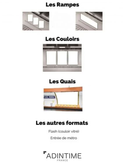
To begin, you can determine the format of your poster. Here are the standard sizes of billboards and posters in France:

>>> Learn more about billboard formats and prices
Ideal for areas with high pedestrian traffic, such as bus stops or shop windows, the 2m² format ensures excellent visibility at close range. Targeting a local audience, it is perfect for promoting nearby offers or events. To maximize impact, opt for a clean design, eye-catching visuals, and a message that is readable at a glance.
The 4m² format is a versatile choice, often used in densely populated urban areas. It combines visibility and accessibility, making it ideal for capturing the attention of both motorists and pedestrians. Use striking visuals with vibrant colors and concise text to ensure a clear message, even on the move.
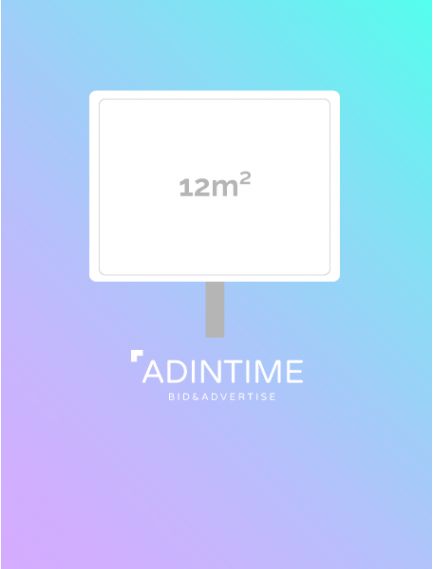
With its impressive visual impact, the 12m² format is perfect for large-scale campaigns. Positioned along major roadways, it easily catches the attention of drivers. Use high-contrast visuals and a concise message, readable from a distance, to maximize effectiveness.
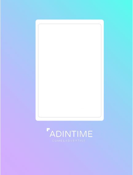
Displayed in subway stations, this poster targets a captive audience waiting for their train. With prolonged proximity, you can include detailed visuals and more elaborate messages. Prioritize vibrant colors and elements that prompt action, such as a QR code for more information.
Posters on the side of buses offer great mobility and reach a diverse urban audience. Their lateral visibility is ideal for campaigns targeting a broad public. Choose a simple design with striking visuals and bold typography to quickly grab attention, even in motion.
Positioned at eye level for motorists, bus rear posters benefit from prolonged visibility in traffic. They are ideal for direct messages or calls to action. Use readable text and impactful visuals to leave a lasting impression, even in just a few seconds.
The whole point of a billboard campaign is that it remains anchored in the mind of your audience and this is done as well by your visual as by your advertising message. That's why, in addition to taking care of the graphic design of your poster, you must find a catchy, punchy and short message that consumers will easily remember. (By the way, this advice applies to all advertising formats: TV, radio, press, etc.)
Most people who see your poster will only read your advertising slogan: make sure they don't forget it.
Part of your advertising message is in the visual of your poster and in the colors you use in your composition. It is therefore essential to pay particular attention to the colors and their symbolism. Because yes, each color has a different meaning. The color of your poster will influence the perception of consumers.
So use :
Each color, each shade has a multitude of meanings, it's up to you to find the right ones and associate them well.
Because yes, it's no secret that some colors don't go together. But beyond an aesthetic question, some color combinations prevent your message from being read because of

NB : your poster must be readable by everyone, don't forget the color blind who can't distinguish certain colors.

Source image : Les Yeux du Daltonisme
As with colors, typography can bring a different dimension to the creation of your advertising poster: if the font is well chosen, it will reinforce your message. If, on the contrary, it does not match your message, it can make it lose all its meaning. Serif, sans serif, italic... There is a multitude of fonts and combinations of typographic parameters to carry your poster campaign.
This plethora of fonts does not mean that you have carte blanche to use them all:

In the same vein, you should not overload your poster. The simpler your poster is, the clearer it will be, which will allow consumers to better remember the information you are communicating. The goal of a poster advertising campaign is to communicate quickly and effectively.
The colors and fonts you choose for your poster should compliment your marketing message, but they should also be consistent with your graphic identity if you have one. Using the graphic elements of your visual identity helps establish or reinforce your brand image with the public. By familiarizing the public with the elements of your graphic charter, it will be easier for them to recognize your brand during your other communication campaigns.
Prioritizing the content of your campaign poster is essential to the understanding of your message by the audience you are trying to reach. This classification of information is done both on the scale of typography and the spatial arrangement of the graphic elements of your poster.
It is possible to hierarchize your text by using a single font, you just have to play on the size of the characters, bold, italic, alternate lower case and upper case...
To place the different elements that make up your visual, it is important to know the path followed by our eye when it discovers an image. Indeed, our eyes tend to follow a particular path when exploring a poster or any other document: it is the Z reading. Our eyes will land consecutively on the 4 intersections of the horizontal and vertical lines that pass through the thirds of an image. These points are the strategic locations to place the most important information of your poster.

In order to allow you to evaluate the effectiveness of your advertising poster, JCDecaux has developed Optix Creative Heatmap In-situ, an AI capable of evaluating the effectiveness of a visual display in its environment. This is based on various criteria, including the composition of the image, the viewing distance and the orientation of the media. The "heatmaps" generated allow you to improve your visual so that your message reaches your target more effectively.

In classic print advertising, it can be complicated to follow the performance of your campaign and study its impact. But fortunately, there are tricks to overcome this small problem. Indeed, it is possible to set up visual elements on your poster which, in addition to allowing you to follow or track the performance of your campaign, will allow you to make the public interact with your brand:
This is what ECCO, a Danish shoe manufacturer, decided to do in 2017 in the Hong Kong subway stations.
And you will have understood, it is necessary to integrate this reflection during the design of your poster.
Defining your target audience is crucial to creating an effective advertisement. Start by identifying:
Put yourself in your audience’s shoes: what do they want to see, understand, or feel? Include elements that grab their attention and prompt a response, such as a clear call to action (e.g., "Check out our limited-time offer").
Finally, consider the context in which your audience will see the ad: an urban audience on the move requires striking visuals and a short message, while a stationary audience, such as in a subway, can absorb more information. A compelling advertisement is one that speaks directly to its target audience, delivers the right message at the right time, and creates an immediate connection.
Billboard advertising is a medium that does not escape the French legislative framework that applies to other advertising sectors. Thus, billboards must include certain legal mentions in order to be broadcast. Remember to integrate this information when designing your campaign visual.
All visuals intended for billboard advertising must include the RCS (Registre du Commerce et des Sociétés) registration of the company or agency. The RCS must be visible: it is preferable to place it on the left side of your poster.
Any poster promoting processed food and/or beverage products must display one of the following 4 legal health statements:
This mention must be visible on the poster and in a horizontal position.
Billboard advertisements promoting automotive items are required to include messages that promote alternative modes of transportation to the car (active, shared or public transportation):
This information must be identical and easily legible and clearly distinguishable from the advertising message and other mandatory information, such as the label relating to the CO2 emission class.
This label provides summary information on the environmental impact of the vehicle being advertised. This requirement applies to advertisements for M1 passenger cars. The label must be easily readable and separate from any other mandatory information.
Private higher education institutions are required to display on their promotional posters their status and the certification they have received from the State. This mention must appear horizontally, and in a visible and legible manner. Example: "Private institution delivering RNCP level 7 certified degrees/diplomas".
The energy field is not exempt from the obligation to display certain information on these advertising posters. All companies in the energy sector (regardless of the type of energy used) must prominently display the following educational message: "L'énergie est notre avenir, économisons-la !" ("Energy is our future, let's save it!" - free translation)
However, this obligation does not apply to energy-consuming appliances, nor to the recruitment or financial advertising of energy suppliers.
All signs indicating the price of a product or service must clearly and prominently display the validity date of the offer (e.g., Offre valable du 1er au 30 juin - Offer valid from June 1 to 30).
>>> Learn more about the regulation of advertising displays
When printing your advertisement, it’s essential to understand the difference between CMYK and RGB color modes. The CMYK mode (Cyan, Magenta, Yellow, Black) is specifically designed for printing. It uses inks to reproduce colors and is ideal for ensuring accurate color rendering on paper. Before sending your file to the printer, make sure it is converted to CMYK to avoid unexpected color variations.
In contrast, the RGB mode (Red, Green, Blue) is used for screens. It relies on an additive combination of lights to create colors, offering a broader palette and often more vibrant tones than CMYK. However, this mode is not suitable for printing, as RGB colors may not be reproducible with inks.
For the best results, create your visuals in RGB mode if your work is intended for screens, but always convert your files to CMYK for printing.
Additionally, use a resolution of 300 DPI (dots per inch) and a high-quality PDF format. These precautions ensure consistent colors and a professional finish for your advertisements.
For all posters, it is mandatory that the file containing your visual to be printed includes the bleed (overflow of the visual which serves as a safety zone) as well as the cutting lines. Each control room establishes the dimensions to be used for the bleed of the posters.
In order to avoid that your typographic choices go unnoticed during the printing of your poster, it is preferable to vectorize all your fonts.
 Cinema ads : formats, ad networks and rates to communicate on the big screen
 Media and non-media communication: what are the differences?
 Advertising pressure How to optimize it in your campaigns ?
 What is a media mix? A guide to allocating your advertising budget
 Native Advertising : What is it and how does it differ from display advertising?


: Formats and Rates")


