

 Top 30 best ads musics
 The influence of advertising on purchasing behavior
 Top of the most listened podcasts in France
 Top 30 best ads 2021 in France
 This Year Marketing Calendar
 Adintime joins “Les Relocalisateurs”: empowering media through technology
 OOH Advertising: My honest review
 Facebook Ads Library: The ultimate guide to winning campaigns
 How to prepare your advertising campaigns for Christmas?
 The top 20 ad films of the year
Billboard France
Answer within 48h
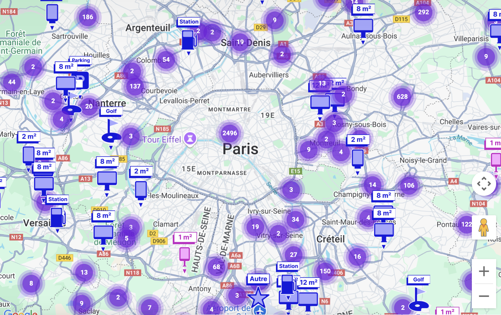
New ! Find your advertising panels at a glance ![]() DISCOVER
DISCOVER
Choisissez un dispositif sur la carte pour voir ses détails et l'ajouter à votre sélection.

In a world where consumer attention is increasingly sought after, the creation of a catchy advertisement poster is essential to stand out and capture the public's interest. Whether it's to promote a product, an event, or a cause, a well-designed poster can significantly impact the perception and actions of your target audience. In this article, we will explore the steps and best practices for designing an effective and impactful advertisement poster.
Advertisement posters serve several key objectives in the field of marketing and communication. They help to:
Attract attention: A well-designed poster immediately catches the viewer's eye with attractive visual elements and a clear message.
Advertisement posters are powerful tools for effectively communicating with your audience and achieving your marketing goals.
Before starting the design, it's crucial to clearly define the objective of your poster. Ask yourself the following questions: What do you want to achieve with this poster? What is the main message you want to convey? Your objective might be to promote a product, announce an event, raise awareness about a cause, etc. The main message should be simple, clear, and easily understandable.
Knowing your target audience is essential to create a poster that resonates with them. Identify demographic characteristics (age, gender, location), psychographics (interests, values, behaviors), and their specific needs or problems. This understanding will allow you to tailor the content and design of your poster to be relevant and attractive to your audience.
The color choices for your poster play a crucial role in its visual appeal. They should be chosen based on their ability to attract attention and evoke specific emotions. Use colors that harmonize with your message and brand image.
Images and illustrations must be of high quality and relevant to your message. They should help capture attention and reinforce the main message. Avoid overly generic or low-quality images that can harm the perception of your poster.
Titles and subtitles should be catchy and effectively summarize the message of your poster. Use powerful words and short phrases to quickly capture attention.
Slogans and catchphrases are essential to make a lasting impression. They should be memorable, concise, and relevant to the objective of your poster.
Readability is crucial in poster design. Use clear and legible fonts, and ensure the font size is large enough to be read from a distance.
Limit the number of different fonts to two or three to avoid a cluttered look. Ensure the fonts complement each other and contribute to the overall aesthetic of the poster.
A call to action (CTA) is essential to guide your audience to the next step. Whether it's "Buy now," "Sign up," or "Visit our website," your CTA should be clear, visible, and compelling.
Before finalizing your poster, conduct tests to evaluate its effectiveness. Show it to a sample of your target audience and gather their feedback. Make the necessary adjustments to enhance visual impact and message clarity.
By following these steps, you will be able to create a catchy advertising poster that attracts attention, communicates your message effectively, and encourages action.
.jpg)
Visual hierarchy is a key concept in graphic design that involves arranging elements to guide the viewer's eye through the poster in order of importance. Here are some techniques to achieve this:
White space, or negative space, is the empty area around the elements of your poster. It plays a crucial role for several reasons:
Your poster should align with your company's brand image to reinforce recognition and recall. This includes:
.jpg)
An overloaded poster can easily lose the viewer's attention. Limit text and visuals to essential information. Focus on a main message and avoid cluttering the poster with too many details.
Color choice is crucial. Poorly chosen colors can make the poster unreadable or unattractive. Ensure that the chosen colors are harmonious and adhere to contrast principles to ensure readability.
Using complex or too small fonts can make your poster difficult to read. Opt for simple, clear fonts and ensure that the font size is large enough to be read from a distance.
A poster without a focal point will fail to capture attention. Ensure that your poster has a main element that immediately draws the eye, such as a striking title, a strong image, or a clear call to action.
Several graphic design software can help you create professional posters:
High-quality images are essential for a catchy poster. Here are some resources:
To find ideas and templates, check out these resources:
Creating an eye-catching advertising poster requires careful planning and meticulous execution. By clearly defining your objective and audience, designing an attractive layout, crafting compelling content, and following best design practices, you can create a poster that captures attention and drives action.
Remember to test your poster with your target audience and adjust based on feedback. Design is an iterative process, and continuous optimization can greatly enhance the effectiveness of your advertising poster. Use analytical tools to measure the impact of your posters and adjust your strategies accordingly for even better results.
Discover our wide range of advertising panels in France and abroad to broadcast and make your eye-catching advertising poster visible.


 ad campaign from A to Z")


